#1. I really like this photo. The steam rising off of the bison gives the picture a real life feel. I also like that she followed the odd number of animals rule and that they are stretched out through the whole picture. I also like the contrast of the top half when compared to the bottom half of the picture. I like that it is darker on the top and lighter on the bottom. The bison are illuminated in a way that makes them seem very peaceful.
YNP-4969.jpg
#2. This picture is very beautiful. I like how intense the colors are, and how the tree and landscape are a silhouette. It is a very powerful picture. I also like that it is a rather simple composition.
pic22.jpg
#3. This picture looks like a drawing which makes it really unique. I like how the animals seem to be framed by the grass around them. They also were captured in a perfect moment to look like they were posing for the picture. I like that the animals are sharp and the hair looks fluffy.
38107_1540336555069_7024809_n.jpg
#4. I love the way the light is hitting the spider web in this picture. I wish that the spider was in a little better focus. The green color in the picture stands out to me a lot. I think the exposure could have been a little lesser than it currently is. Some parts of the picture seem to be a little too bright for me. I like that the spider is centered in the picture, it allows the viewers eyes to immediately look at the spider and then its surroundings.
073.jpg
#5. I really enjoy the water in this photo. The light reflects off of the water in a way that makes it look like lava to me. I like how the water and the clouds are the most clear and in focus. To me, it looks like the calm before the storm. This is a unique picture.
sun+set.jpg
#6. I cannot stop staring at the clouds in this picture. The colors are wonderful and i like the powerful light coming out from behind the clouds. I also like how the foreground is a silhouette. It definitely makes me want to escape to this lake because of the peacefulness that the picture offers.
EDIT-0769.jpg
#7. This is a wonderful photo. I love the rainbow peeking out in the clouds. I also love the contrast between the dark sky and the greens and yellows in the field beneath it. I like the intense line that seems to cut the picture in half, it is very powerful. I with there was a little more sharpness in the clouds.
Art+Final+Photo-1.jpg
#8. The reflection of the mountains in this picture is amazing. I like how clearly it shows in the water. I also like how blue the sky is, it is very powerful and contrasts well with the other colors in the landscape. I also like how many different angles and lines the mountains and rolling hills create. my eyes are always moving around the picture finding new things to look at and focus on. i also like that you can see slight details in the mountains even tho they are so far back in the picture plane.
untitled+%283+of+21%29.jpg
#9. I like how the bear is framed by the trees around him. It is nice that the bear is the only darker colored object in the picture. It contrasts nicely with the bright shades of green of the foliage. I also like how the bears head is turned as if he/she doesn't know someone is taking its photo. I kind of wish the picture was a little less bright. some of the greens seem a bit too bright. maybe it is just how it looks on a computer screen.
100_1961.jpg
#10. I like this picture. It is a bit blurry but i think it kind of works in this picture. I like how the moose is the center of the picture and seems to be curiously looking towards the photographer. I like the white and blue colors in the background. one distracting part of the picture is the glare on the right side of the picture, it would look much better without it. I also like the small bits of green color throughout the background of the picture. it does well to compliment the large amounts of blue in the picture.
moose-7011.jpg
Monday, December 9, 2013
Wednesday, December 4, 2013
30 photos for final
Location:
Gallatin Gateway, MT Canon rebel
ISO:
1000 55mm f/5.6
1/80
Location:
Gallatin Gateway, MT canon
rebel
ISO:
100 47mm
f/9 1/200
Location:
Redlodge,
MT canon rebel
ISO:
320 49mm
f/5.6 1/60
Location:
Redlodge,
MT canon rebel
ISO:
100 18mm
f/7.1 1/125
Location:
Redlodge,MT canon rebel
ISO:100
18mm f/7.1 1/125
Location:
Redlodge,MT canon rebel
ISO:100 41mm
f/7.1 1/125
Location:
Sheridan, WY canon rebel
ISO:
200 46mm
f/15.6 1/60
Location:
Clearmont,
WY canon rebel
ISO:200 46mm
f/5.6 1/60
Location:
Wyoming canon rebel
ISO:
100 21mm
f/10 1/250
Location:
Gallatin Gateway,MT canon rebel
ISO:
100 55mm
f/6.3 1/100
Location:
Gallatin Gateway, MT canon rebel
ISO:
100 55mm
f/9 1/200
Location:
Gallatin Gateway, MT canon rebel
ISO:
100 33mm
f/5 1/80
Location:
Gallatin Gateway,MT canon rebel
ISO:
100 55mm
f/16 1/640
Location:
Redlodge,
MT canon rebel
ISO:
125 21mm
f/3.5 1/30
Location:
Redlodge,
MT canon rebel
ISO:
100 18mm f/4.5 1/60
Location:
Redlodge,
MT canon rebel
ISO:
100 21mm f/5.6 1/100
Location:
Redlodge,MT canon rebel
ISO:
100 23mm f/4.5 1/60
Location:
Redlodge,MT canon rebel
ISO:
640 55mm f/5.6 1/80
Location:
Redlodge,MT canon rebel
ISO:
640 55mm f/5.6 1/100
Location:
Redlodge,MT canon rebel
ISO:
200 39mm
f/5 1/50
Location:
Redlodge,MT canon rebel
ISO:
320 55mm f/5.6 1/80
Location:
Redlodge,,MT canon rebel
ISO:
100 18mm
f/4 1/40
Location:
Redlodge,MT canon rebel
ISO:
500 51mm f/5.6 1/80
Location:
Redlodge,MT canon rebel
ISO:
800 55mm
f/5.6 1/80
Location:
Redlodge,MT canon rebel
ISO:
500 55mm
f/5.6 1/80
Location:
Redlodge,MT canon rebel
ISO:
100 35mm
f/7.1 1/125
Location:
Gallatin Gateway, MT canon rebel
ISO:
100 29mm
f/7.1 1/100
Location:
Gallatin Gateway,MT canon rebel
ISO:
100 55mm
f/8 1/200
Location:
Gallatin Gateway,MT canon rebel
ISO:
100 55mm
f/10 1/250
Location:
Gallatin Gateway, MT canon rebel
ISO:
125 55mm
f/5.6 1/80
Tuesday, November 26, 2013
blog assignment
#1. This is a very unique picture. The water looks almost like clouds to me. Maybe it is clouds and not water... It's very hard to tell. I like the diagonal line that the mountains create in the photo, it reminds me of the slashing format in art when you are setting up a painting. I think that the photo effectively shows the steepness of the mountainsides and does them justice. It is a very nice picture, but I don't think that I would want a copy of it in my house. It just isn't super appealing to me.
#2. I really like the blues in this photo. They are very calm and appealing to the eye. I don't really like that the lower half of the picture is blurry. I think that the picture would look better as a whole if the entire thing was clear and detailed. Blur in pictures tends to give me a headache. I like the clarity in the rock, I think it makes it a more powerful image because the main focus is clear and detailed. This picture is kind of hard to look at for a long period of time.
#3. This is a pretty neat picture. I like animals in action. I would assume that a high shutter speed was used when taking this picture because of the clear image of the squirrel. My action shots usually end up being more on the blurry side which is frustrating. I really like the detail in the squirrels paws. I also like that the squirrel as a whole is the only not blurry part of the picture. In this type of picture I would say that it works because it allows you to solely focus on the subject and not the surroundings. In other pictures, blurriness can be annoying, like in #2 above. Seeing the detail in the hair of the squirrel is a nice touch too.
Tuesday, November 19, 2013
Black and White... again. =)
Here are some black and white photos that i really enjoy.
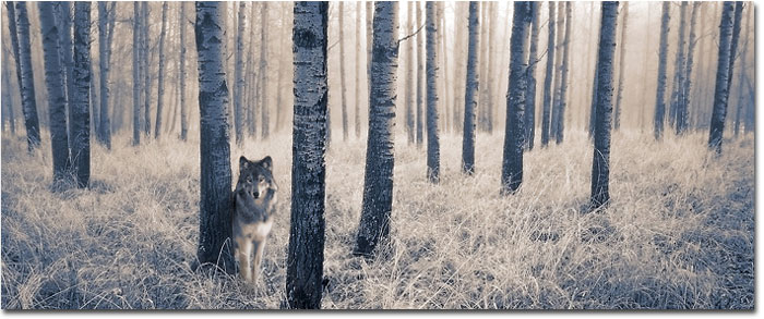
 I find this photo to be very unique because the subject matter is a monochromatic animal. It makes me feel that the photographer wanted to capture the amazing contrast of the animal as well as converting the background colors into the black and white for an added touch. I was unable to find the name of the photographer.

This picture was taken by a photographer named Heinrich van den Berg. The black in this photo is very powerful to me. I think it allows us to focus on all of the lighter parts, like the detail in the eyes. It is a very curious picture. I want a poster of it to hang in my house.
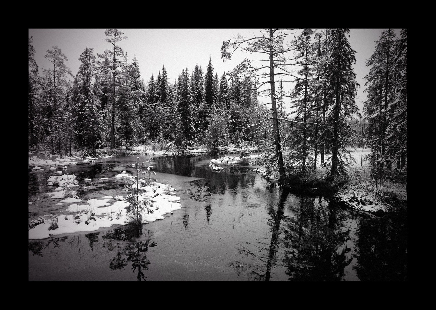
This picture is kind of hard to see, but i really like the water and the snow together. By making this picture black and white, i think it makes the scenery look more mystical and mysterious in a way. I like how dark the water turned out because it contrasts well with the snow on the banks. I also like how you can see the reflections of the trees in the water. I was unable to find the name of this photographer.
Black and White
I found this interesting article about taking black and white photos.
It talks a bit about how to set up a picture for black and white so you can get the most out of the picture when you go to edit it. It was interesting to read about how to pick the right subject matter. The section on setting up your camera was also very helpful because sometimes it is hard to know what settings to use. Basically i think it just takes a lot of practice to get the hang of taking amazing black and white photos.
Black and White Photography Article
Thursday, November 7, 2013
fall colors


In this picture i was messing around with the light. I actually like how it turned out. The light is very bright but it works for me. I like odd pictures.

I found out that birds are difficult to photograph. I also don't have a lens with a lot of zoom so that made it more challenging to get a good picture. All of mine are not very close up but i still think they turned out alright.

I like this picture. I took it out of randomness but something about it pleases my eye. I like the yellow and blue together, they seem to compliment each other. I like the way the light hits the leaves in different ways. Some of my pictures might be a little over exposed but they are pleasing to my eye.
All of these photos were taken with my Canon.
Thursday, October 31, 2013
Happy Halloween!!

I really like this pumpkin photo because every pumpkin is fully illuminated and bright. There are many shades of orange and yellow in this picture. The only thing if find to be rather distracting is the lamp light in the left corner. My eye goes directly to it when it should go to the pumpkins because they are the main focus. Maybe if the light was a little less bright it wouldn't be as noticeable. I was unable to find the photographer of this photo.

I really like this portrait. There seems to be an intensity in the boy's eyes and i like that it is in black and white so there is more of a contrast between the makeup and his hair and his coat. I guess i like how many different shades of black and white are in this photo. Photographer unknown.

Halloween is not complete without a black cat! I like the angle that this photo was taken from. I think it would be better if you could see more detail in the cats eyes. They are very bright and i think that it would be cooler to see the life in its eyes. You can tell a
lot when you look into an animals eyes and i think the bright light takes that away. I do like that you can see every little hair and detail of the cats face. It makes me want to pet it and snuggle it. Photographer unknown.

This photo is amazing to me. I really like castles and large buildings. Something about this photo is very mysterious and makes me want to go explore and see what i find. I like how there is so much depth to this photo, it shows that there is quite a bit of distance from the front trees to the actual castle, and then who knows how far away the hot air balloon really is. The photographers watermark is in the middle of the photo but i was unable to read it.
HAPPY HALLOWEEN!
Thursday, October 24, 2013
sunflowers!

Sunday, October 13, 2013
street photography tips
This photographer has posted some pretty cool tips for shooting street photography. She brought up some points that i wouldn't have thought of on my own. I like reading about different photographers points of view and tips that they provide. I really liked the tip that showed using different objects to frame your subjects.
photography tips
photography tips
barns!
I really like pictures of old farms and the neat things you find on them. Old barns are really beautiful to me. This website has a lot of great barn pictures. They are each unique because the composition and setting of each are different. Someday i'd like to have the opportunity to attempt some creative barn shots. Some of the shots have some really great clouds in them, almost to the point that they look fake. I wasn't really able to find out each photographers techniques and such but nevertheless, the pictures are beautiful. Here is the link (hope that it works)
barn pictures
Thursday, October 3, 2013
on the road...
This past weekend i traveled to Sheridan, Wyoming. I took a bunch of pictures, however, most of them were taken from inside the car while we were on the interstate. Here are a few!
 This picture was almost awesome! The crappy part is how the bottom of the picture is blurry. Sharpness is better than blur. The top half of the picture is definitely more appealing that the lower half of the picture. Part of the blurriness is the fact that we were driving on the interstate.
 I like this picture because it is not blurry! We were out in a farm field shooting shotguns when i thought that this would make a neat picture. I really like the lighting and the shadows that the tree creates. I also like how the water can be partially seen sneaking through the landscape.
 On the way home we encountered some pretty neat skies while the sun was setting. I tried to capture some of the bright, deep colors. I really like the clouds and the yellow of the sun.
 As the sun went behind the clouds and it started to get darker, i noticed how cool the clouds looked. I only got the tops of the trees in the picture because i wanted to have mostly sky. I was afraid if the picture was of sky only, It wouldn't be very appealing. I like the shades of grey throughout the sky and i also like how the trees are just dark silhouettes instead of very detailed trees.
Tuesday, October 1, 2013
critiques!
#1. This picture is pretty cool to me because of the action that is being captured. This is not an everyday image that you would be able to go out and randomly capture. I like how pretty much all of the photo is in focus. I also really like how the bear's hair is very clear and the detail can be seen. I also like the fact that you can see the eye of the fish clearly. I would hate to know what is going through the mind of that fish at this particular moment. The picture didn't load very well when I was trying to view it.
#2. I really like this picture because fall/autumn is my favorite season of the year. The vibrant colors of the changing leaves is captured in this photo. I like that it is bright and almost looks fake because of how bright it is. I like how the water looks. I'd like to go hang out in this picture. I thought of the rule that red is more attractive than yellow, which kind of made me laugh because I think in this instance, the yellow shown in this picture is attractive to me.
#3. I'm not a big fan of this picture because it looks pretty fake to me and I don't want to spend time looking at it like I do with other pictures. I like the contrast between the dark and light shades but I think the white on the right side of the picture is kind of distracting. I like the left side of the picture ten times better.
#4. I like the mountains in this picture, but the sky distracts me away from them. when I first look at the picture I see the white cloudy looking part of the background. It kind of takes something away from the starry blue/black night sky. The jaggedness of the mountains is definitely an eye catcher.
#5. I love the cool calming colors of this picture. I also like the levels that catch my eye. they start with the sky, then move down to the trees, then too the hilly areas, and then to the flatter parts.
#6. I really like this picture because I am drawn to bright colors. Every important part of this picture is clear and in focus. I like that the bird is centered in the photo and is large enough to fill the space. It definitely looks better than if the photographer hadn't zoomed in as closely to the bird. I also like how the branches go vertically and diagonally. I think that it helps to divide the picture and also helps your eye to move around and look at all parts of the picture.
#7. This is also a cool action photo but I don't like that the details of the bear's face cannot be seen. I also think that the water droplets might be a little to over exposed and draw attention away from the main subject of the photo. I like the rocks on the left with the moss on them, just wish that the bear was a little more sharp.
#8. In this picture my attention is drawn to the left half of the picture, which is unfortunate because the subject matter is located in the right half. The moose seems out of focus and is kind of in the dark so it is not focus on when someone is viewing the picture.
#9. I think that this picture is very awkward. I think that the position of the birds wings takes away from the fact that it is catching a fish. It also takes away from the intense look on the birds face. The picture could have also been a bit sharper.
#10. This picture seems pretty simple to me. looks like the rule of thirds was considered when choosing how to set up this shot. I almost like the upper half of the picture better than the whole. if you took out the bear sitting in the water and zoomed in to the bear in the background, it would be a pretty cool shot because of how the sky and the clouds look.
Thursday, September 26, 2013
http://www.naturephotographers.net/articles0103/dw0103-1.html
I was surfing the internet last night and found this article. It focuses on converting color photos into black and white, and also gives directions for other cool photoshop features. I think it would be fun to try some of them. The article is from the Nature Photographers Online Magazine. Pretty neat!
Here is one of the pictures from the article.
Wednesday, September 18, 2013
I decided to post about some of my favorite things this week!


I love fish. These are two of my five angelfish that i have at home in my aquarium. This picture was also taken with an iPhone. I really enjoy how bright the colors turned out. It is also a great picture because the fish didn't come out blurry. It took quite a few tries to get a picture that wasn't blurry.
 Yet another iPhone picture! I love animals. This is my hamster. I was bored one day so i decided to photograph him. I like how it looks like he is chuckling in the shirt pocket. The dark colors on the shirt give a nice contrast to his light coloring.

Lastly, this is my yellow lab, his name is Clyde. I like this picture because i love my doggy, and also because of the rainbow! My dad took this picture with his iPhone yesterday and sent it to me. The rainbow makes a pretty nice background for this picture. I wish the upper left side of the picture wasn't so bright. It is kind of distracting to me. The bluish sky in the right half of the picture is much more appealing than the bright white in the left.
Lastly, this is my yellow lab, his name is Clyde. I like this picture because i love my doggy, and also because of the rainbow! My dad took this picture with his iPhone yesterday and sent it to me. The rainbow makes a pretty nice background for this picture. I wish the upper left side of the picture wasn't so bright. It is kind of distracting to me. The bluish sky in the right half of the picture is much more appealing than the bright white in the left.
Subscribe to:
Posts (Atom)